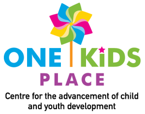
One Kids Place
DEVELOPMENT OF NAME, NEW VISUAL IDENTITY AND BRAND GUIDELINES
CHALLENGE
The board of the Northern Shores Children’s Treatment Centre needed an imaginative brand and name for their new facility, which would serve children needing rehabilitative services in the districts of Muskoka, Nipissing and Parry Sound.

INSIGHT AND KEY CONSIDERATIONS
This, the first new children’s treatment centre established in Ontario in 20 years, would provide therapy and support services to children with physical, communication and developmental needs. The client felt that their brand needed to put kids and families first, and be colourful. They also requested the name be easily translated into French. The brand would become central to an ongoing education campaign to make the general public aware of what the children’s treatment centre actually does and what services it offers.
IMPLEMENTATION
We began by conducting regional focus groups to test various naming and visual concepts to ascertain the most appropriate look and feel. Based on the feedback from those meetings, we created a pinwheel design with bright colours to represent the services coming together for children, and to remind everyone that this centre is for kids above all else. We created the simple name “One Kids Place” to represent the various health services available in one place. The name easily translated into French and is not geographically specific, so it can be used when centres open in all the districts.
RESULTS
The implementation of the One Kids Place brand has been very successful. It raised awareness and provided a unique and clear identity for this new health care facility for children. The pubic is becoming increasingly aware of the organization and familiar with its mandate and services.


