Understanding the Elements of Design
Blog-Header_Understanding-the-Elements-of-Design

There was a time when great design required a four year degree, a light box, expensive pencils and countless years of experience. Today, thanks to tools like Canva, Stencil, or Crello, businesses have easy access to a host of beautiful graphic design templates to create awesome designs for their social media or marketing. 

The thing is, one size doesn’t fit all and design changes can be tricky. When that happens you’re going to have to get your hands dirty in the world of graphic design.


Never fear! We’re here to help with 5 basic design elements so you can dig in and create incredible designs on your own.

Graphics_Understanding the Elements of Design-03

LINES

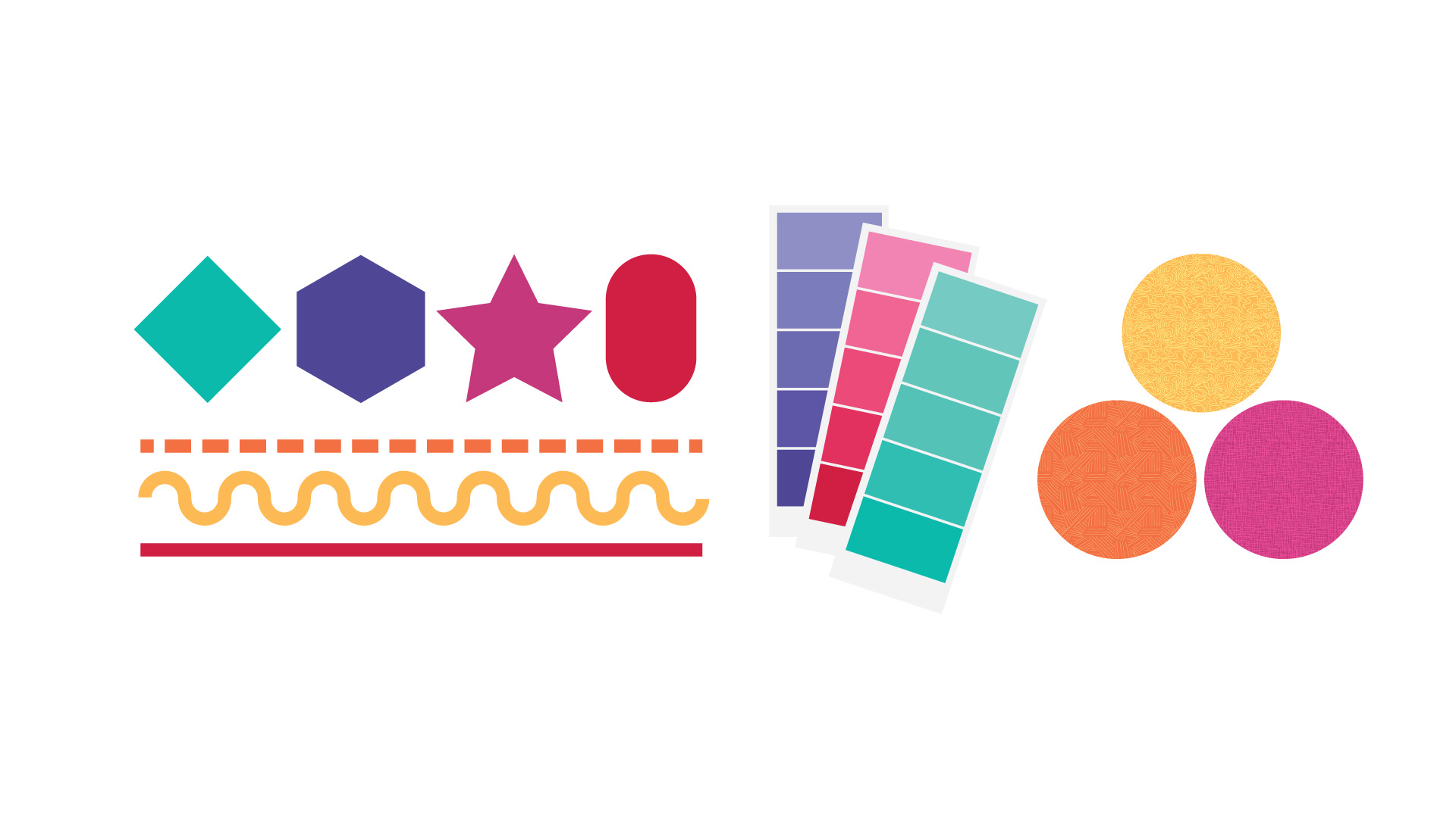
The great divider, or should I say the great connector? Making smart use of lines, whether dotted, thick, thin, or curvy, you have access to a world of design potential. You can use lines to highlight items, anchor parts of your design, or to connect parts of your work together. 

Graphics_Understanding the Elements of Design-04

SHAPES

Shapes help create rooms or spaces in your work. The clever use of shapes will help you frame certain elements, balance your design, or fill up your space creatively. You can also create shapes out of negative space too. This can be used to draw attention to a particular area of your design.

Graphics_Understanding the Elements of Design-05

COLOURS

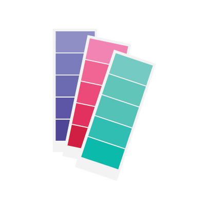
A clever palette will influence your audience by giving your design a particular mood or energy. Colours move in trends in each industry and therefore need to be selected wisely. Creating a limited pallet of eye catching colours will be a huge help when creating designs for your website, social media, and digital marketing. Colours are also closely associated with brands, so, if you’re working with a particular brand or product, make sure your design colours support brand standards for consistency and customer recognition.

Graphics_Understanding the Elements of Design-06

TEXTURES

Adding textures give a sense of depth and weight. Textures leave audiences with a tactile association which can add to your overall message. Clean, contemporary messages don’t want rough textures, while tough rugged designs don’t benefit from soft textures.

Graphics_Understanding the Elements of Design-07

TYPEFACE

Fonts, like textures and colours, not only deliver a written message, but support the overall look and feel of design. Clever use of typeface can completely transform your content and change the intent or mood of your design.

The basics are just that, the basics. If you’d like to know more about design concepts, you can read our blog ‘The 6 Principles of Graphic Design’ which will give you an overview of the key considerations a designer uses when doing layout.

Happy designing!

Need help creating professional and effective designs?

At TWG Communications we’re excited to help you create engaging designs that will get you noticed.